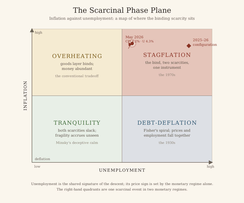
This is the first of these. The rule is simple: take the two numbers that define the map, put a marker where they cross, and argue about which way it is heading. No forecasts. Just a position and a direction, written down where anyone can check it later.
The two coordinates
Inflation runs up the vertical axis, and it is high and climbing. Headline prices reached 4.2 percent in May, the third straight month of acceleration and the highest reading in over a year.
Unemployment runs along the horizontal, and it is low but has stopped falling. The rate held at 4.3 percent for a second month, off its lows, drifting the wrong way.
Plot 4.2 against 4.3 and the marker lands in the upper right. Prices rising, unemployment rising. That is the stagflation corner.
It is not a forecast. It is a location.
Why this is the hard quadrant
This framework cares about that corner more than the other three, for one reason. Everywhere else, a single move fixes things. Prices too high and jobs plentiful? Raise rates. Prices falling and people out of work? Cut them.
In the upper right there is no such move. Raise rates and you deepen the unemployment. Cut them and you feed the inflation. Every tool makes one of the two problems worse, which is why this corner produces paralysis rather than policy.
And the record confirms exactly that. Rates have sat at 3.50 to 3.75 percent, with the market pricing a near-certain hold. That is not patience. That is a central bank with no move that does not cost it something.
What the bond market thinks
The pressure has surfaced at the long end. The 30-year Treasury yield cracked 5 percent in late May, its highest since 2007.
Which is the market saying something specific. Short rates are what a central bank controls. Long rates are what everyone else thinks about inflation and about whether the government can pay. When the short end is pinned and the long end climbs anyway, the shortage has moved to where nobody can reach it.
The reading, and its caveats
So: upper right, stagflation corner. Inflation pushed up by an energy shock. Unemployment edging sideways. And the long end of the bond market carrying the strain that policy will not.
Now the honest caveats, because a reading is not a prophecy.
Much of this inflation is a single energy shock, and the underlying number is cooler than the headline. If oil settles, the vertical axis falls on its own and this whole reading ages badly. Unemployment at 4.3 percent is still low by any historical standard. And two months is not a trend.
The next reading moves the marker and, more importantly, shows the direction of travel. The single number most worth watching between now and then is the underlying inflation rate. If it keeps cooling while the headline stays high, this was an oil story. If it climbs to meet the headline, it was not.
As of 15 June 2026. Figures: BLS CPI and employment releases for May 2026, and Treasury yields as of late May to early June. A reading through a framework, conditional and about direction rather than magnitude, not investment advice.