Curiosities
Things that don't fit the dispatch format but are worth building and seeing. Interactive tools, maps, and other instruments for looking at the world through the framework's lens, and occasionally far outside it.
Health
Where scarcity shows up in bodies rather than balance sheets.
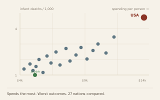
Spending vs outcomes · 27 nations · OECD data
What Health Care Buys
The United States spends $13,473 per person and has the worst infant mortality and shortest life expectancy of any rich country. Japan spends $5,365 and leads the world on both. Twenty-seven systems compared, each with a synopsis and rated wait times for physicals, minor surgery, and major surgery.
Open the comparison ›
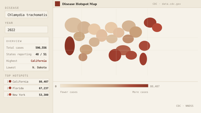
Interactive map · CDC data
Disease Hotspot Map
Select any nationally notifiable disease and year from the CDC's NNDSS data set. The map recolors by state case count, light for fewer, oxblood for more, with a ranked sidebar and state-by-state tooltip. Scarcity shows up in health systems too; this is where it lands geographically.
Open the map ›
Commodities
The things that get grown, dug up, and priced.
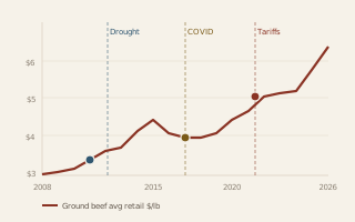
Annotated chart · BLS APU0000703112 · 2008–2026
Ground Beef Price, 2008–2026
Eighteen years of retail ground beef prices annotated by scarcity type: the real drought-driven herd shortage of 2011–2015, the COVID meatpacking bottleneck of 2020, and the compound tariff-and-screwworm stack driving prices above $6.80 in 2026. A companion to the dispatch on which shortage is actually behind the beef price.
Open the chart ›
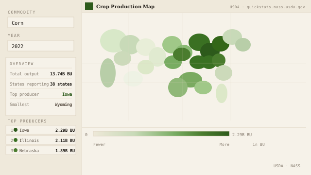
Interactive map · USDA NASS data
Crop Production Map
Select any commodity, corn, soybeans, wheat, cotton, hay, and more, and a year from 2000 to 2023. The map shades each state by total output, with a ranked sidebar and per-state tooltip showing volume and share of national production. Data from USDA NASS Quick Stats; requires a free API key.
Open the map ›
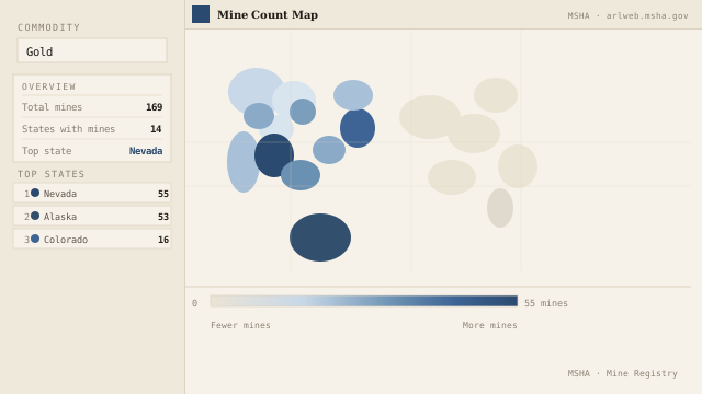
Interactive map · MSHA data
Mine Count Map
Select a commodity, gold, copper, coal, limestone, sand & gravel, and more, to see how active mines are distributed across US states. Data from the MSHA mine registry; counts reflect active and licensed operations. Gold clusters in Nevada and Alaska. Coal fills Appalachia. Sand and gravel is everywhere.
Open the map ›
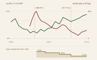
Profits, failures & tax law · BEA · ABI · 1960–2025
Profits Up, Failures Down
Corporate profits reached 13.25 percent of GDP in 2025, the highest in the postwar record, while the top corporate tax rate fell from 52 percent to 21. Every major tax change is marked, and none of them lines up with the turn. The honest finding here is a negative one.
Open the comparison ›
Energy
What it costs, how long it takes, and where it comes from.
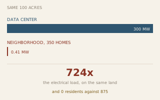
Interactive comparison · land, power, water
A Data Center and a Neighborhood
Build the same hundred acres twice. One way houses 875 people and draws 0.41 megawatts. The other houses nobody and draws 300, which is the residential electricity of a city of 570,000. Adjust site size, IT load, cooling efficiency and housing density and watch the ratios move. The water gap turns out to be the small one, and the argument is mostly about water.
Open the comparison ›
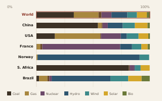
Generation mix · 37 countries · 2025
How the World Makes Electricity
France runs on nuclear, Norway on water, South Africa on coal, Iran almost entirely on gas. Every country’s generation mix broken into coal, gas, oil, nuclear, hydro, wind, solar, and biomass, sortable by any source. In 2025 renewables passed coal worldwide for the first time in a century.
Open the chart ›
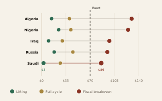
Cost comparison · 19 countries · three measures
What a Barrel Actually Costs
Saudi Arabia lifts a barrel of oil for about three dollars and needs roughly eighty-six to balance its budget. That spread is not geology, it is politics. Extraction cost by country, split into what it costs to pump, what it costs to develop, and what it costs to govern on.
Open the comparison ›
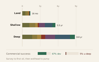
Cycle-time chart · land · shallow · deepwater
From Seismic Survey to Gas Pump
Every phase between a geologist's first survey and a gallon in your tank, for land, shallow water, and deepwater drilling. A land well takes about sixteen months. A deepwater project takes nearly nine years. And seven in ten high-impact exploration wells find nothing worth producing at all.
Open the timeline ›
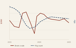
Dual-axis chart · EIA · Baker Hughes · 2015–2025
Rig Count & Brent Crude
Ten years of American drilling rigs and the price of oil, on one chart. Watch the gap between them. Price moves, and drilling answers months later, which is the whole story of shale economics and OPEC strategy at every turn from the 2015 price war to the Ukraine shock.
Open the chart ›
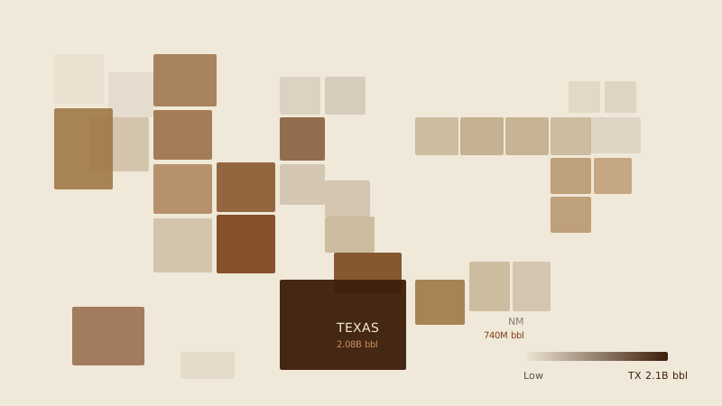
Interactive map · EIA data
Oil Production Map
Select any year from 1981 to 2025 to see how US crude oil production is distributed across states. Data from the EIA. Texas produces nearly half the national total. New Mexico and North Dakota have surged since the shale boom. Alaska's share has fallen every decade since its 1988 peak.
Open the map ›
Politics
Who decides, who pays, and where that has moved over time.
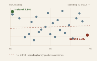
Spending vs attainment · 32 countries · World Bank · PISA
What Education Spending Buys
Ireland devotes 2.9 percent of GDP to education, the least of any rich country here, and finishes near the top on both degrees and reading. Iceland devotes 7.3 percent and finishes below average. Across all 32 countries the correlation between spending and outcomes is almost exactly zero.
Open the comparison ›
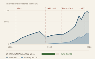
Enrollment and stay rates · IIE · NSF · 1960–2026
Who Came, and Who Stayed
International enrollment went from 48,486 in 1960 to 1.18 million in 2025, and roughly three quarters of international STEM doctorates were still living in the country years after graduating. Nearly every inflection in the line sits beside a change in the law rather than the economy.
Open the comparison ›
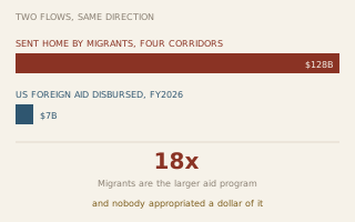
Interactive comparison · aid, migration, fiscal effect
Aid, Migration, and the Money That Goes Home
Foreign aid, migration from the countries receiving it, and what that migration costs or contributes at home, on one page instead of three. US aid disbursed this fiscal year ran under $7 billion after USAID was shut down. Migrants sent about $128 billion through four corridors alone. The fiscal answer flips from negative to positive on a single accounting convention, so that one is a switch you can throw yourself.
Open the comparison ›
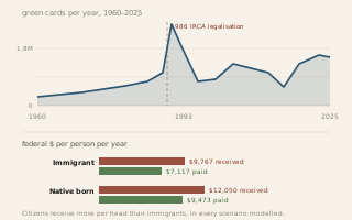
Admissions and fiscal ledger · DHS · National Academies
What an Immigrant Costs
Green cards issued each year since 1960, against federal taxes paid and benefits received per person. Native-born citizens consume more federal resources per head than first-generation immigrants under every scenario the National Academies tested. And the whole argument turns on one accounting assumption worth $3,613 a head.
Open the ledger ›
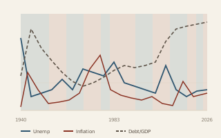
Interactive chart · BLS · BEA · Treasury · 1940–2026
The Economy Under Each Party
Unemployment, real GDP growth, inflation, and the national debt, drawn over a band chart of which party held the White House. Toggle each series, hover any year, and judge the record for yourself. The one clean pattern is the debt ratchet, and it belongs to both parties.
Open the chart ›
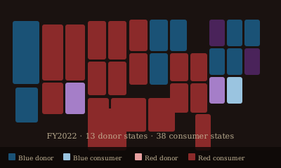
Interactive map · USASpending · BEA · MIT Election Lab
Federal Donor & Consumer States
Which states pay more in federal taxes than they receive in federal spending, and does it follow party lines? Select any fiscal year from 2008 to 2023 to see grants, direct payments, and contracts by state, colored by political lean.
Open the map ›
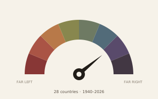
Interpretive gauge · 28 countries · 1940–2026
The Political Spectrum Gauge
Where does each country sit on the spectrum from communism to fascism, and how did it get there? A gauge of the current reading and a timeline of every swing since 1940, for the United States and 27 other countries. Interpretive placements, offered to be disputed.
Open the gauge ›
Curiosities are built when something is worth seeing and the framework gives it a useful frame, or when the data is simply too good not to map. More will appear here as they're finished.